Sabra Introduces New Logo, Packaging
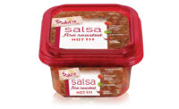
The rebranding includes an updated logo, restyled label design and original on-pack photography highlighting the fresh, plant-based ingredients in Sabra products


Sabra Dipping Company is bringing a fresh look to the table. Sabra catapulted into the snack scene in the past decade as American consumers began sidelining traditional dips and spreads and reaching for fresher, healthier foods with bold flavor. Sabra, with 60% hummus market share, is known for plant-based dips including dozens of varieties of hummus, guacamole and Greek yogurt-based tzatzikis. The brand unveiled a fresh logo and packaging redesign for its complete product line. The rebranding includes an updated logo, restyled label design and original on-pack photography highlighting the fresh, plant-based ingredients in Sabra products. The new packaging will begin hitting retail shelves later this month.
“We are thrilled to introduce a fresh look for Sabra at an exciting time in the food world,” said Eugenio Perrier, Chief Marketing Officer for Sabra Dipping Company. “Cultivating a natural evolution for this unique brand, we sought to enrich the way we communicate visually with consumers on shelf and on pack. From the Sabra sun which is recast as a chickpea evoking the warmth at the heart of the Mediterranean, to fresh ingredients shot in sunshine on a kitchen cutting board, the new designs enhance flavor expectation and beautifully convey Sabra’s brand personality and promise.”
“Sabra changed the way Americans eat, offering delicious, nourishing food we can feel wonderful about enjoying and sharing,” said Julia Beardwood, owner of Beardwood&Co., an award-winning branding and design firm which worked with Sabra’s in-house team on the new creative elements. “The refreshed design preserves the essence of Sabra’s original look while more persuasively telling the story of what is within... fresh ingredients, bold flavors and a food famous for its ability to foster connections. Sabra is a strong brand with a fun, welcoming personality and distinctive products. We look forward to seeing the new designs on tables nationwide.”
“Our approach was in no small part directed by consumers—rebranding is in effect, an exercise in listening,” continued Perrier. “We are in an era of real food. Consumers care more about the quality of ingredients and the innate healthfulness of what we eat. Increasingly, people are prioritizing plant-based nourishment, so as makers of an original plant-based food, and as category leader, Sabra recognized it was time to let the ingredients shine. Since all Sabra recipes are created in our kitchen, we wanted this design to evoke that welcoming and culinary atmosphere while streamlining the way we communicate product and flavor varieties. It was important to retain the clear window which Sabra pioneered to communicate trustworthiness and transparency while giving that mouthwatering glimpse at what awaits you when you open the pack.”
Sabra Obela Global Brand Design Alignment
Sabra Dipping Company is a US/Canadian joint venture between Strauss Group and PepsiCo. The same companies jointly own Obela, our global brand of fresh dips and spreads outside North America. This redesign harmonizes the look and feel of the two brands. “From a global perspective, our intention was to craft a single, engaging brand identity for Sabra and Obela that can be applied to markets around the world,” said Chandler Gotschlich, Associate Director Marketing, Global Brands for Sabra Obela. “These harmonized brands deliver a standard set of consumer expectations for high-quality and freshness in the dips and spreads category that continues our journey to make hummus a global food.”
Packaging History
Sabra, which seemed to achieve an almost overnight success in retail in the mid to late 2000s, had introduced one of the world’s oldest foods to a new market by placing it into what was then very disruptive packaging that invited consumers to see the rich blend of chickpeas, tahini, oils, herbs and spices through a transparent top. The brand drove rapid category growth as retailers cleared shelf space for the flavorful and versatile plant-based dip with its recognizable red rim.
Looking for a reprint of this article?
From high-res PDFs to custom plaques, order your copy today!


